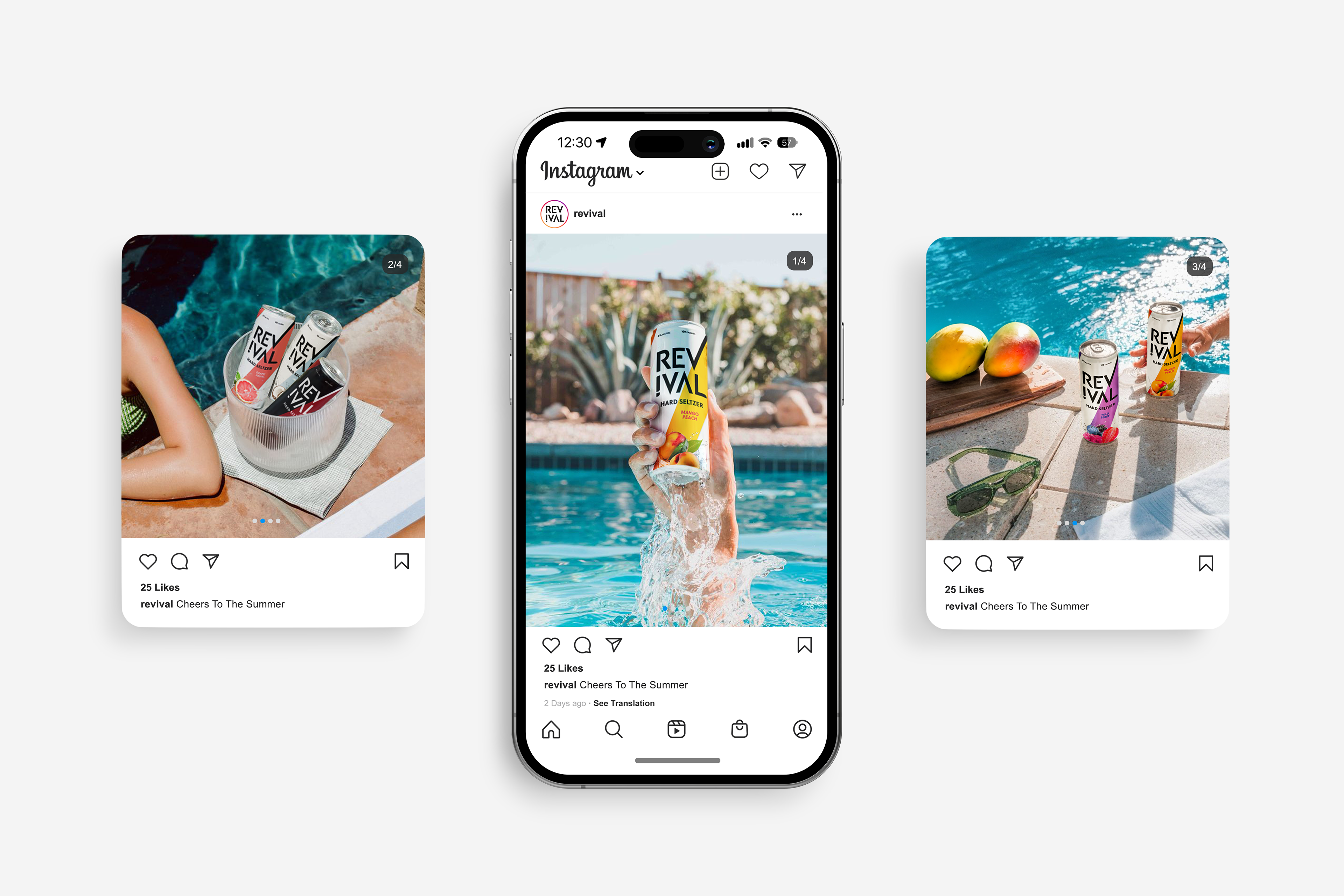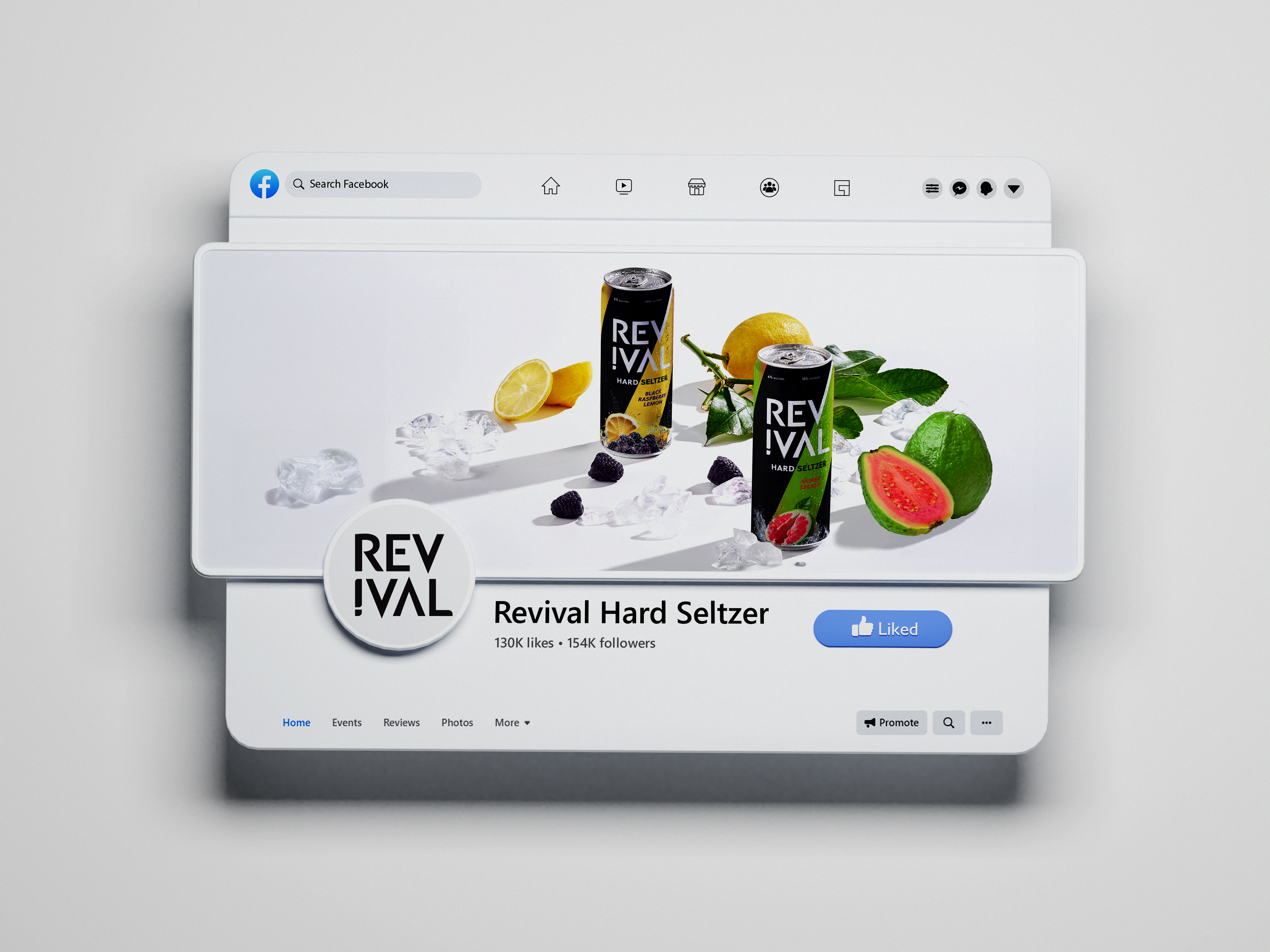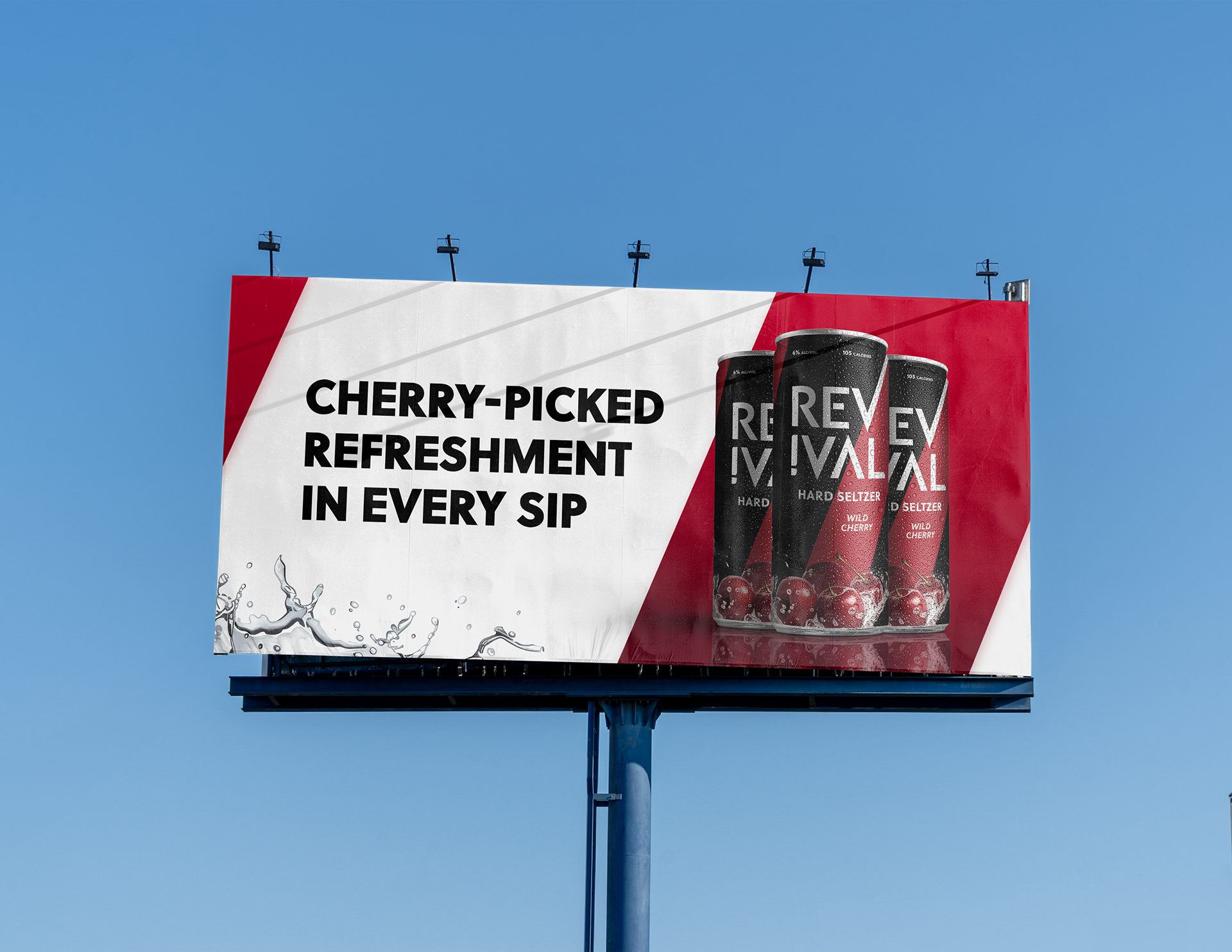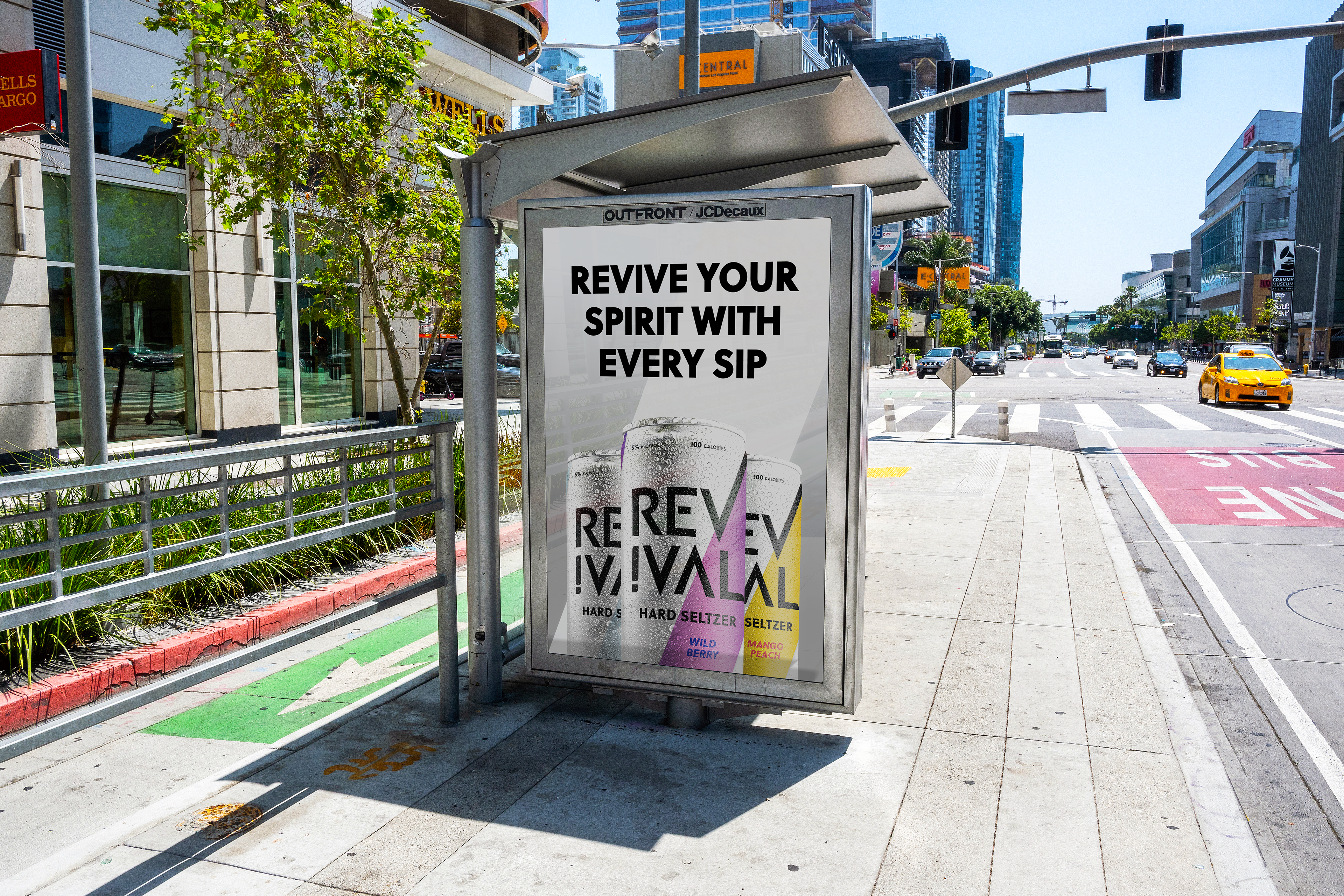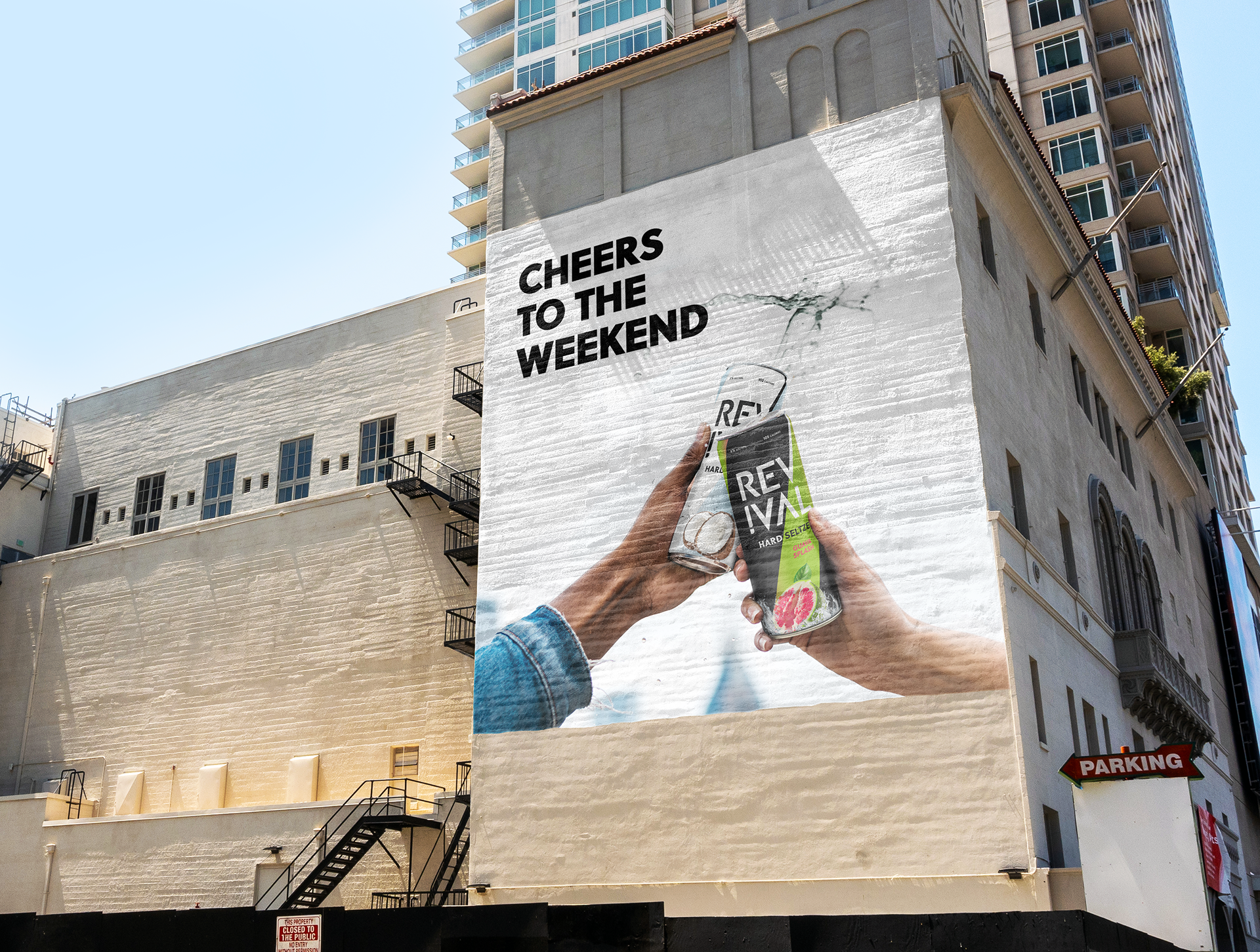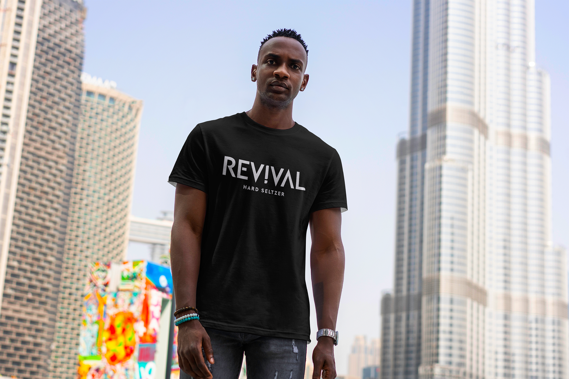
For this project, I was assigned to develop a brand identity of my choice. I chose a hard seltzer brand called Revival, which is an LA based brand tailored to young adults.
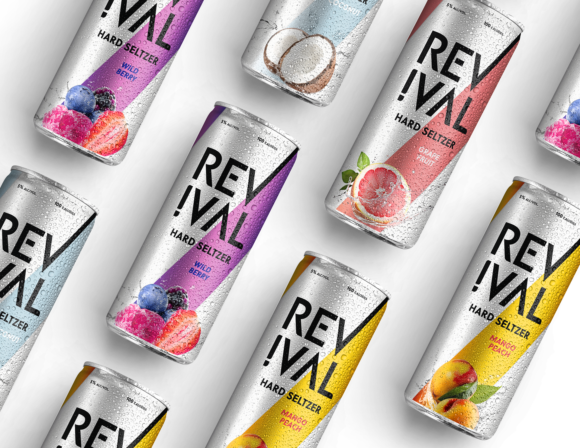
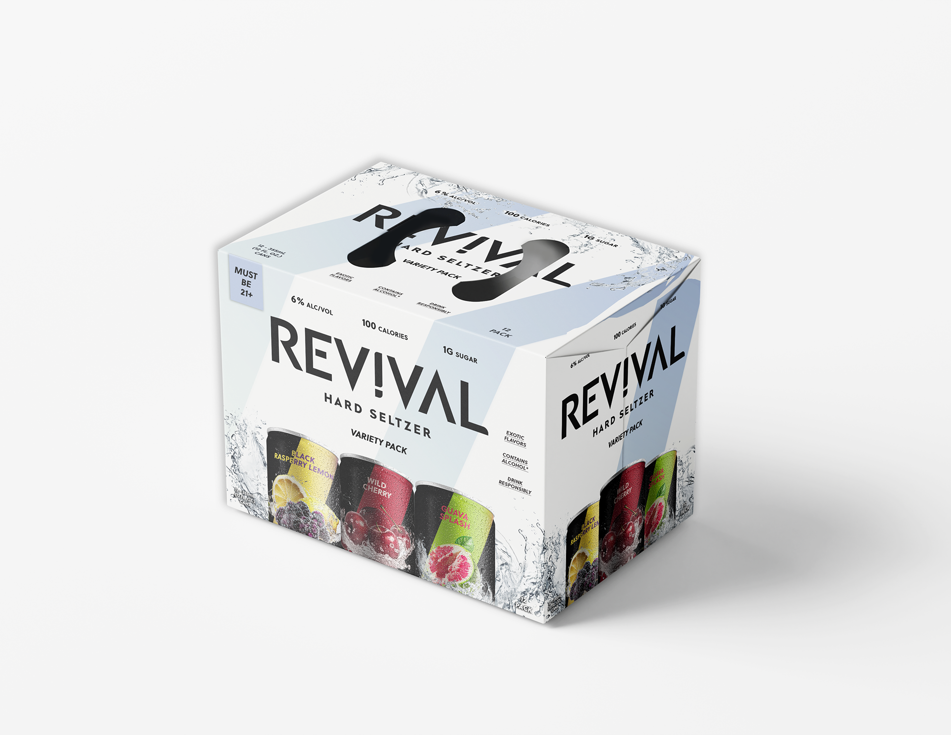
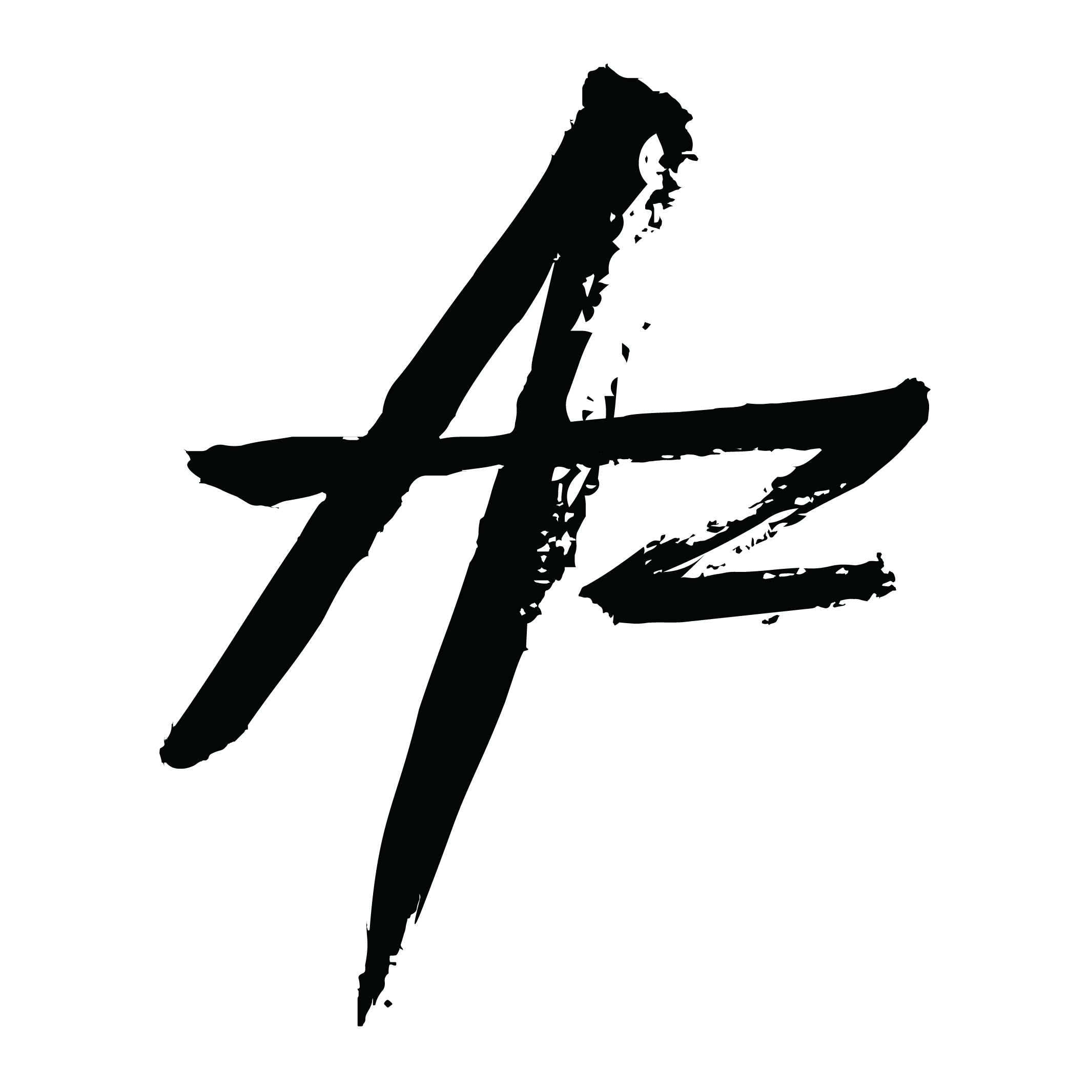
For the logo being displayed on cans, I decided to have the 'V' extend upwards to communicate a reviving motion. That is also why I chose the diagonal design element seen behind the graphics of the flavors.