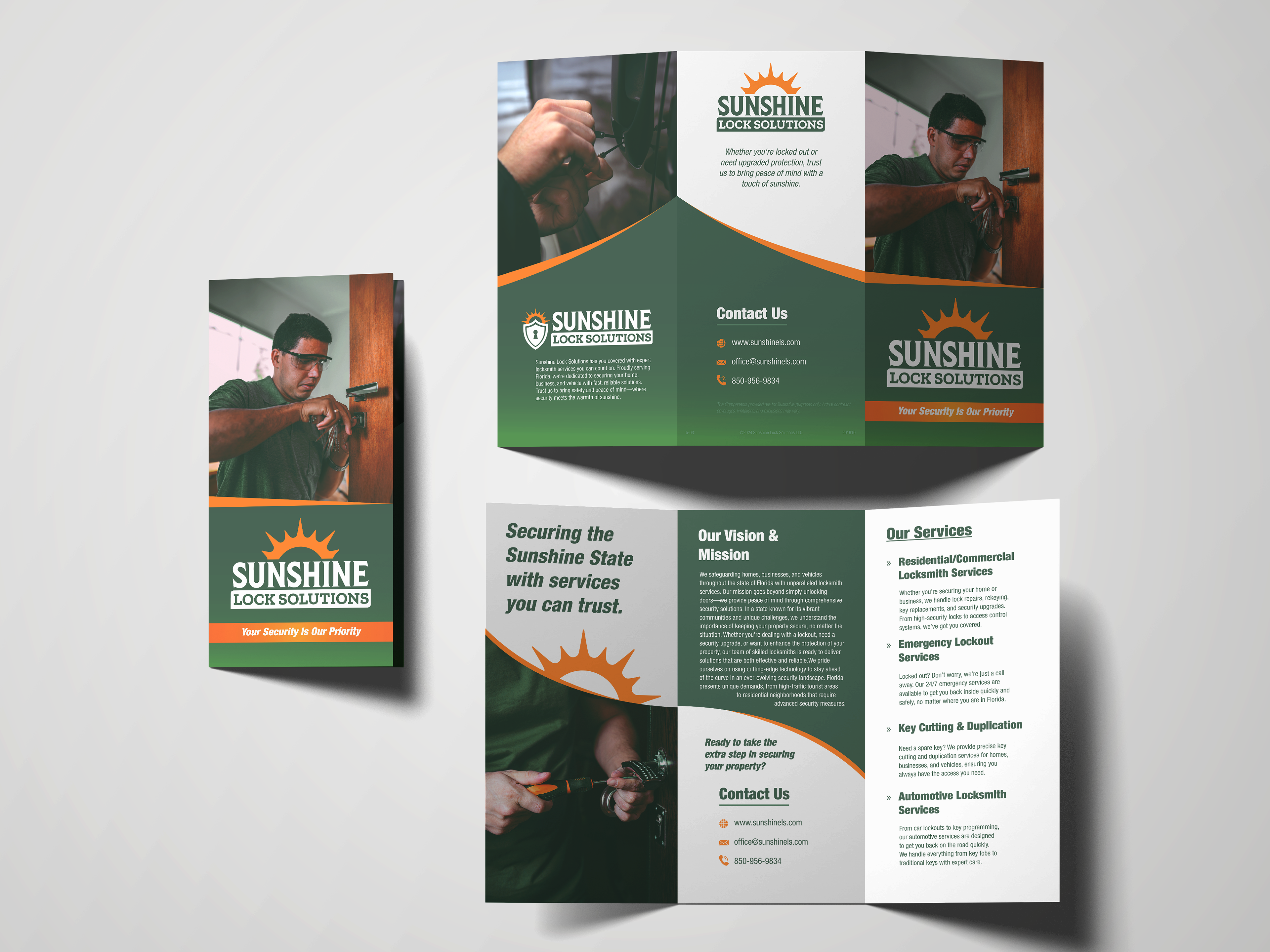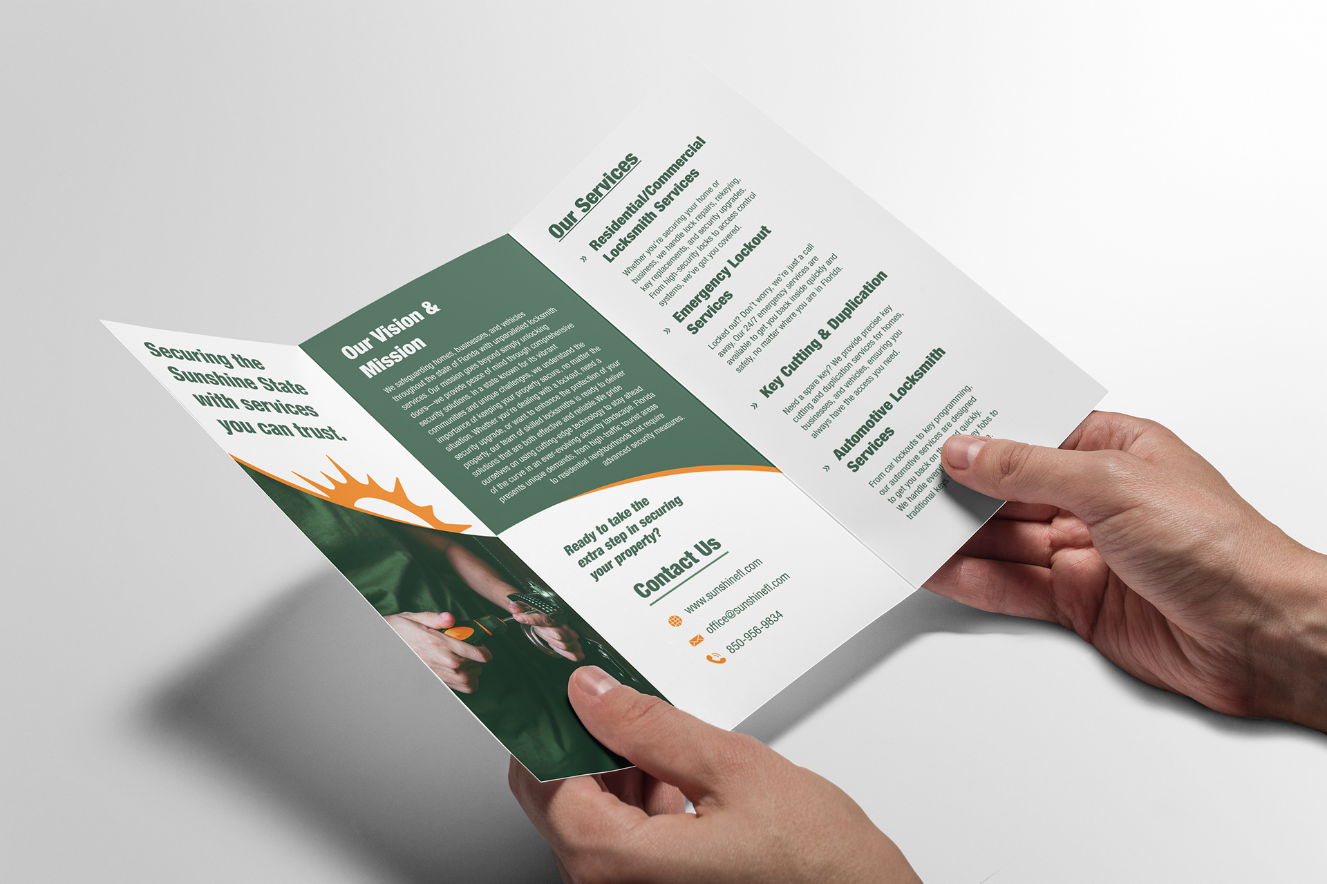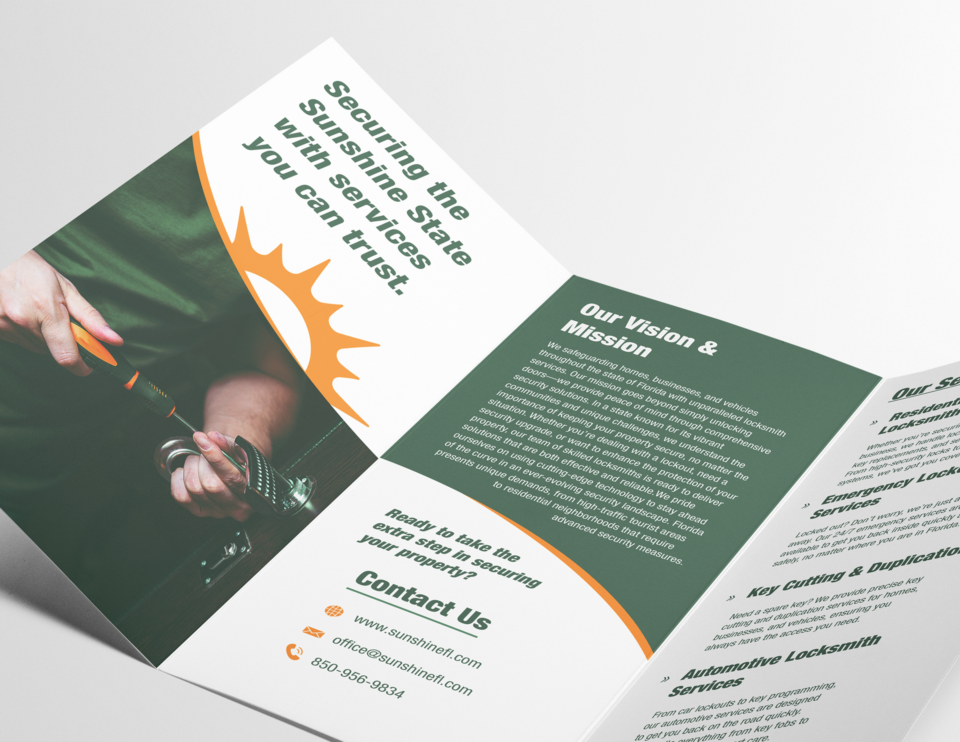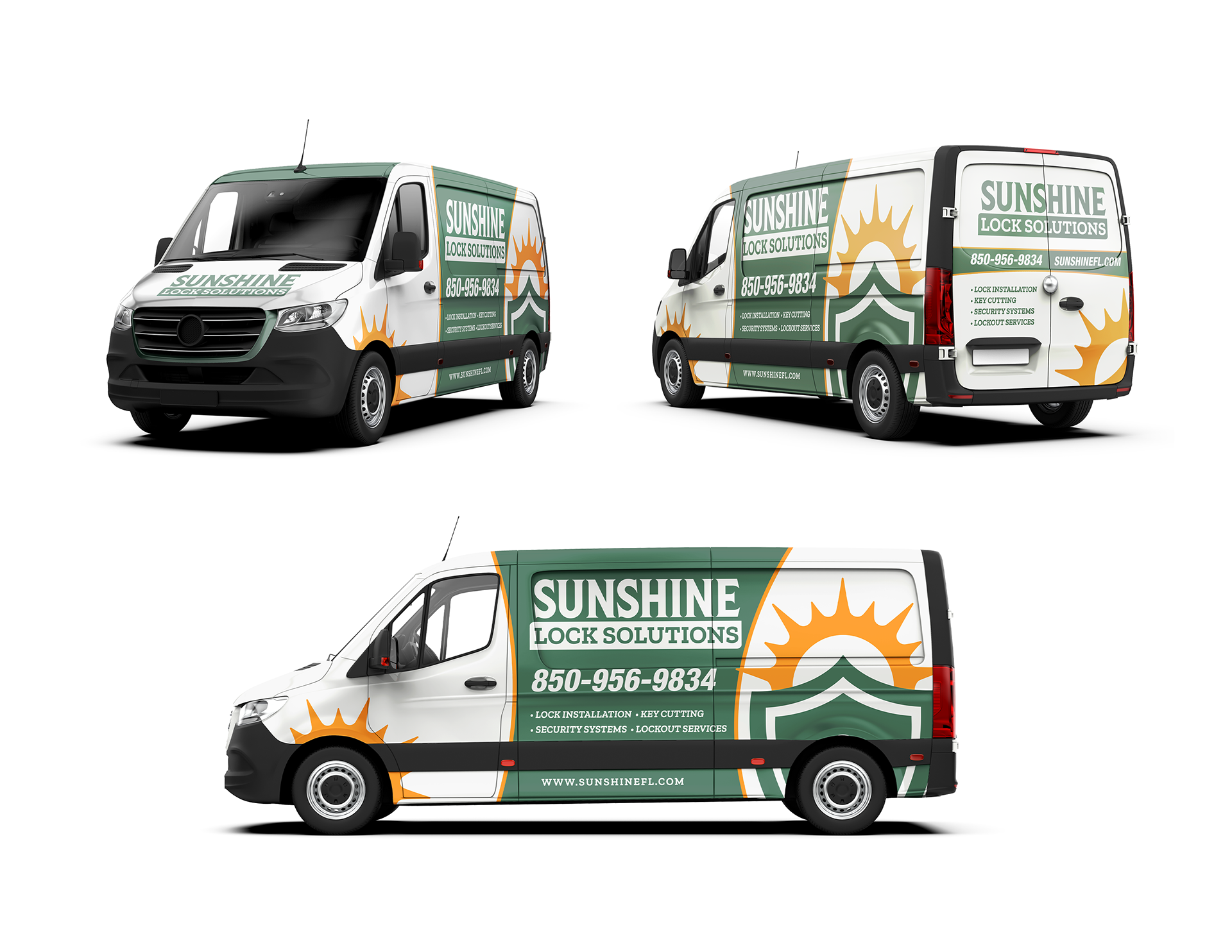

For this project, I wanted to focus on a local, residential-style company commonly seen in real world settings. I chose to design a locksmith company because I've noticed many design issues with locksmith businesses I've encountered, particularly on their vanwraps, flyers, and other promotional materials. A lot of these designs look tacky and unprofessional, so I saw an opportunity to solve these problems by creating a unique brand identity for a locksmith company that communicates strength, security, and reliability, while also representing the state of Florida.
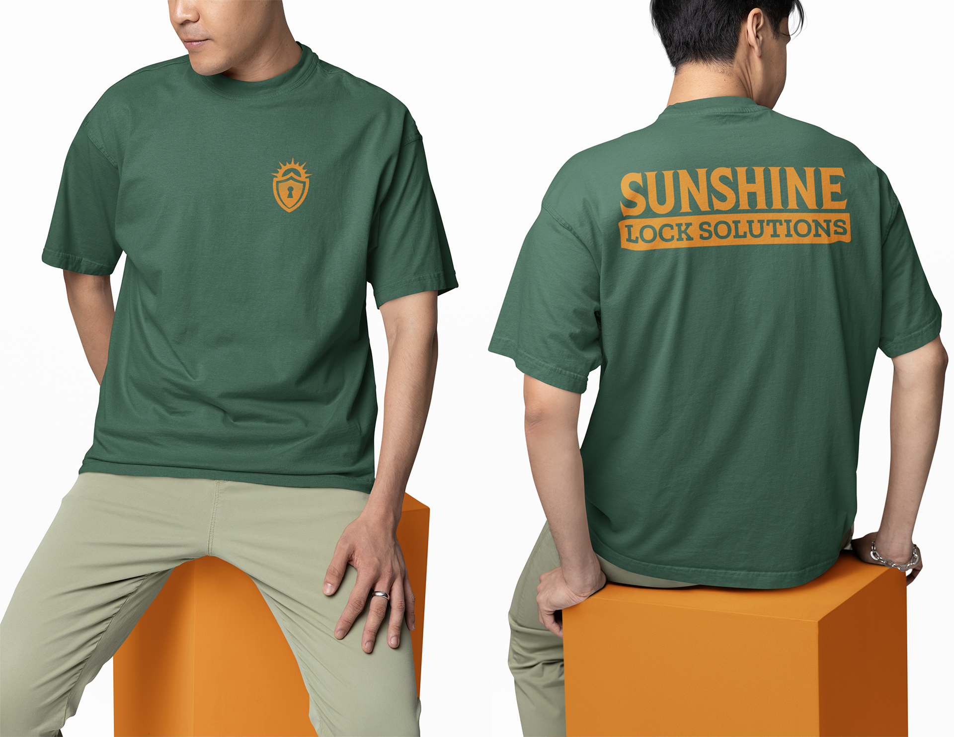
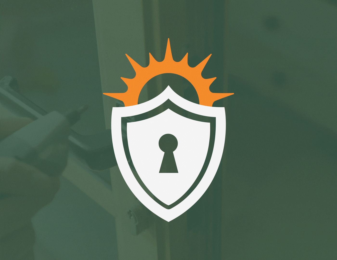
The logo mark I designed features a shield with a rising sun behind it, forming the shape of a lock's shackle. This two-in-one design is meant to be both visually striking and symbolic. At first glance, it appears as a shield, representing strength and security. But when you look closer, the sun and shield together create the shape of a lock, reinforcing the idea of protection and safety in a clever, unified design.
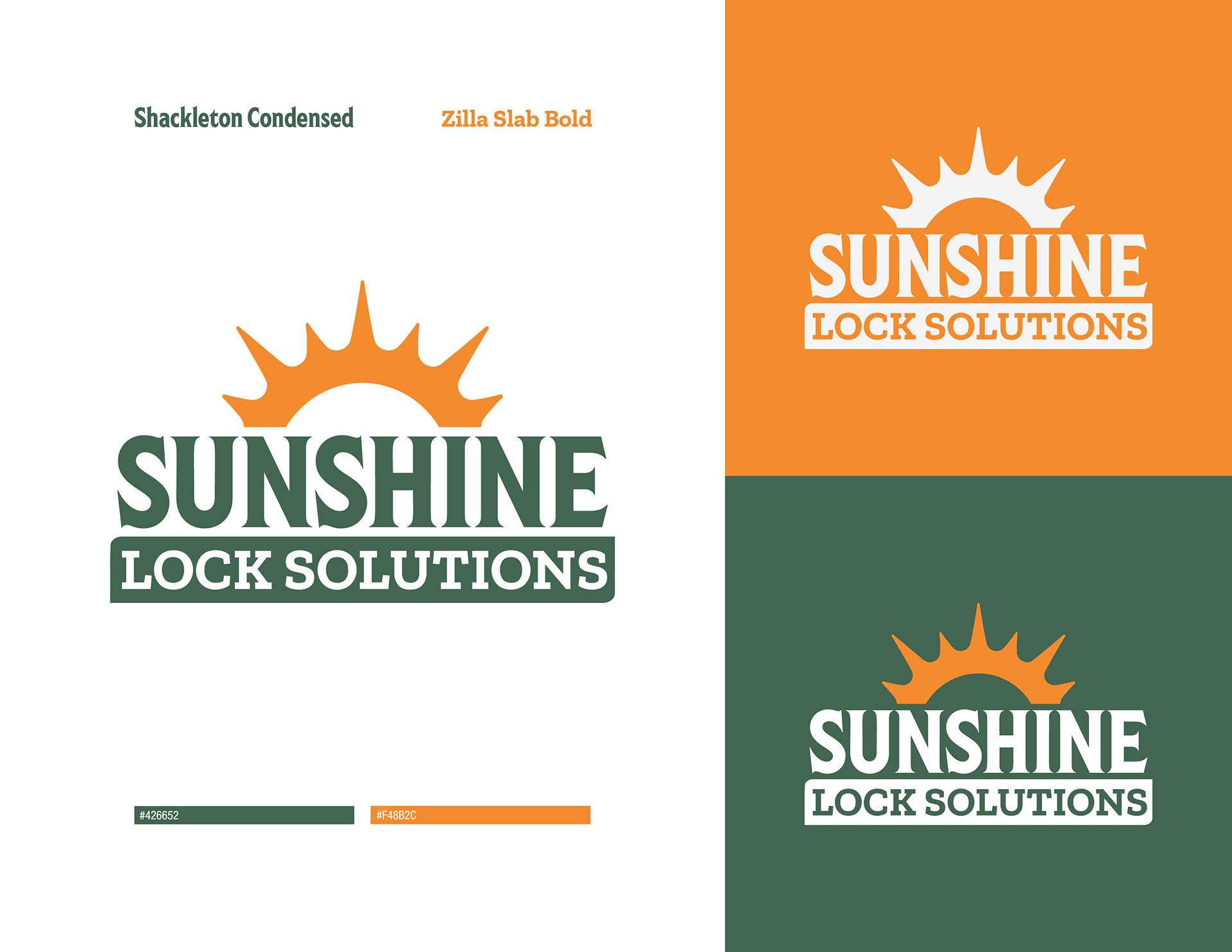
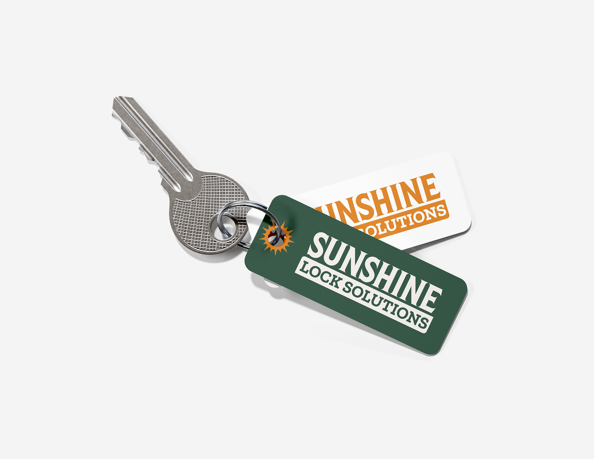
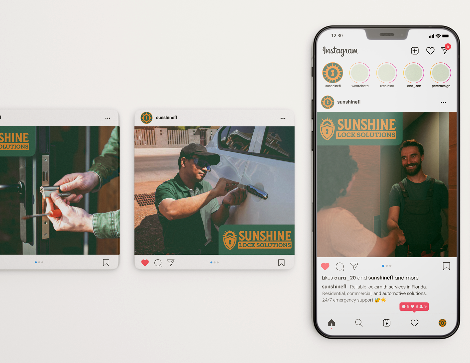
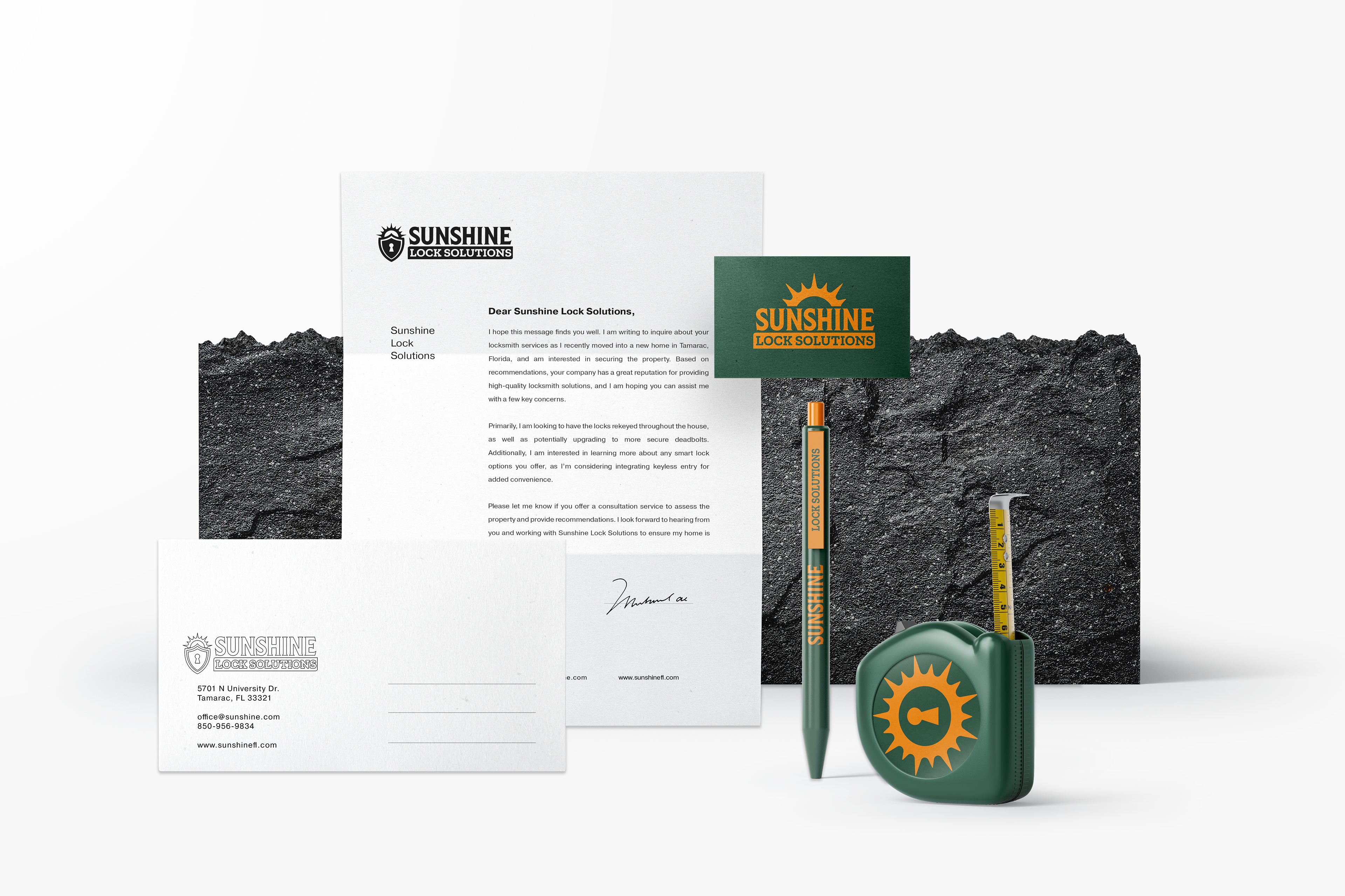
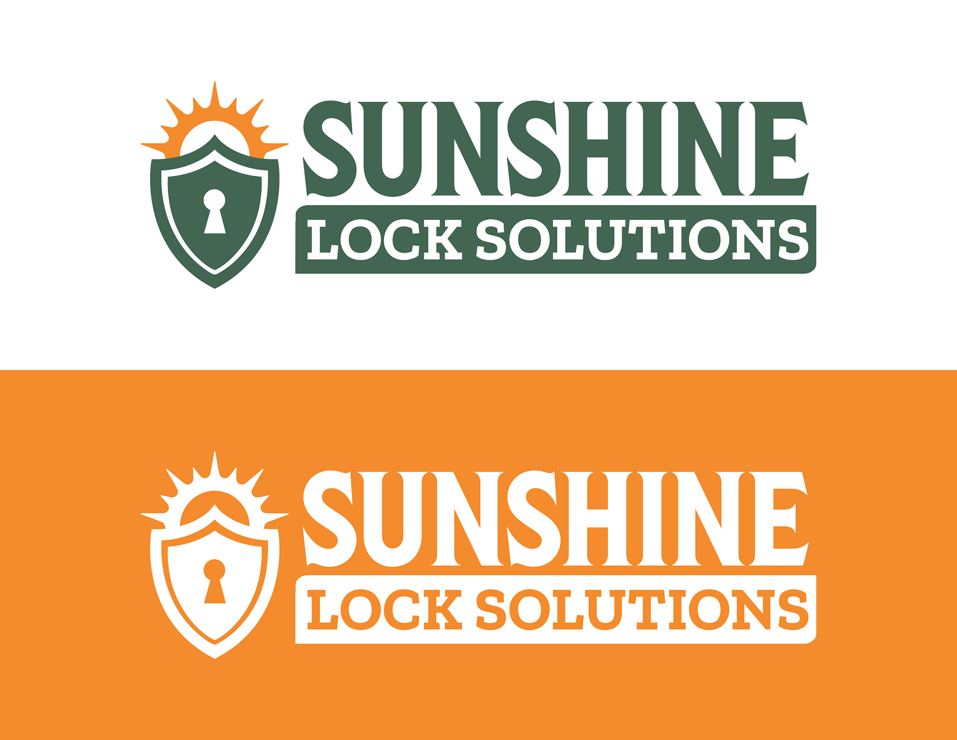
Another variation of the logo mark highlights its success due to its adaptability. The design works well in different formats and sizes, maintaining its clarity and impact across various applications, making it a versatile and effective logo.